+
Consistency is one of the most important functions of a logo. Therefore refinement, not reinvention, is often the best step forward. Our current logo has meaning that we don’t want to lose but it needs to function better. Most importantly, it needs to be versatile and effective across all church communications.
Refinement, not reinvention:
Meet our new Christ Church Somerset West logo.

Oure new logo is a wordmark with a stylised letter ‘“t” that recalls both the cross of Christ as well as the letter“Chi” (X), the first letter in the Greek christogram ΧΡΙΣΤΟΣ (Christos).

Our new logo is responsive. What this means is that it exists in several, slightly different and easily scalable variations. The need for flexible and responsive logo design has grown with the demands of a digital environment.

Our Primary font is Futura. It is a geometric sans-serif typeface based on geometric shapes, especially the circle.
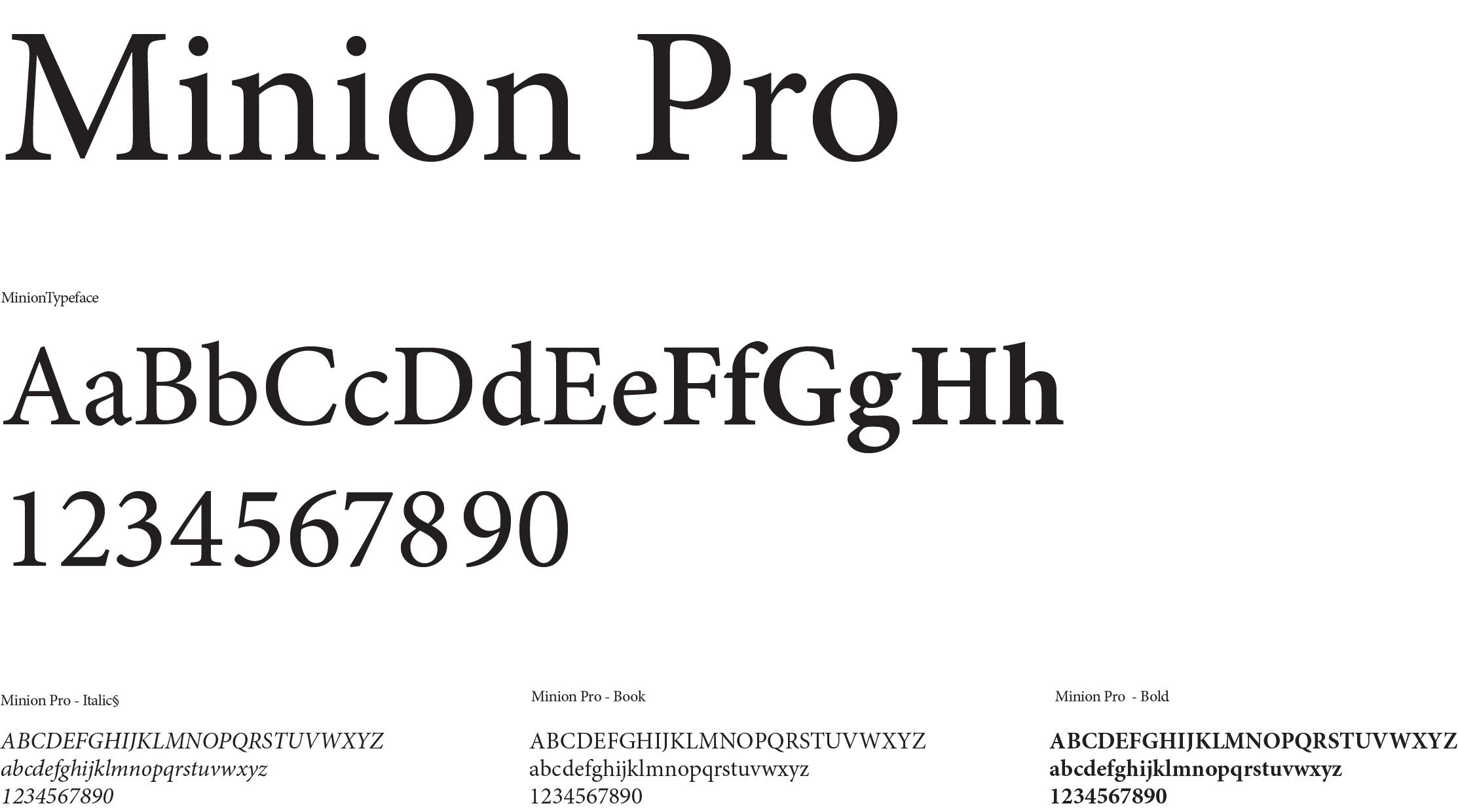
Our secondary font is Minion Pro. Minion is a serif typeface inspired by late Renaissance-era type and intended for body text and extended reading.
